CASE STUDY / MOBILE APP BUILD
Introducing a mobile app to a 25 year old software
Introducing a mobile app to a 25 year old software
Introducing a mobile app to a 25 year old software
How I helped turn a long-running desktop product into a field-ready mobile experience for the people doing the work on site.
How I helped turn a long-running desktop product into a field-ready mobile experience for the people doing the work on site.
How I helped turn a long-running desktop product into a field-ready mobile experience for the people doing the work on site.
ROLE
Design Lead
Design Lead
Design Lead
TIMELINE
8 months
12 months
8 months
OUTCOME
5.0 in App Store
on App store
AREAS
Design, Prototyping, Research
Design, Prototyping, Research
Design, Prototyping, Research
BACKGROUND
From paper proofs to digital field work.
From paper proofs to digital field work.
From paper proofs to digital field work.
Our software TG+ and WT has been a desktop and web-based product for more than 30 years. As field service workers moved away from carbon-copy paper invoicing, the mobile application became the bridge between office teams and the people doing the work on site. I came in to help turn that paper dominated process into a digital experience that was much faster, safer, more reliable, and frankly, catching up with the times. The field service workers were using third party apps to do their tours, report & log incidents, and communicate with each other. Bringing in a mobile app removed the need for multiple apps, and really broadened our offerings.
Our software TG+ and WT has been a desktop and web-based product for more than 30 years. As field service workers moved away from carbon-copy paper invoicing, the mobile application became the bridge between office teams and the people doing the work on site. I came in to help turn that paper dominated process into a digital experience that was much faster, safer, more reliable, and frankly, catching up with the times. The field service workers were using third party apps to do their tours, report & log incidents, and communicate with each other. Bringing in a mobile app removed the need for multiple apps, and broadened our offerings.
Our software TG+ and WT has been a desktop and web-based product for more than 30 years. As field service workers moved away from carbon-copy paper invoicing, the mobile application became the bridge between office teams and the people doing the work on site. I came in to help turn that paper dominated process into a digital experience that was much faster, safer, more reliable, and frankly, catching up with the times. The field service workers were using third party apps to do their tours, report & log incidents, and communicate with each other. Bringing in a mobile app removed the need for multiple apps, and really broadened our offerings.
THE PROBLEM
A mobile tool that could hold up in the field.
A mobile tool that could hold up in the field.
A mobile tool that could hold up in the field.
The workers who would be using the app are not sitting at desks. They are either managers who are moving between locations, managing schedules, recording work, and creating proof of service in real time, or they are security guards who are clocking into shifts, scanning NFC tags or QR codes, reporting incidents and keeping people safe. The experience needed to be clear under pressure, flexible for different clients, and familiar enough that it could fit into an established product without slowing anyone down. We wanted it to feel like a WT product, and communicate with the necessary back end APIs for the legacy desktop software to capture all the data and make sense of it. People didn't need more apps to do their work, they needed one that finally worked.
The workers who would be using the app are not sitting at desks. They are either managers who are moving between locations, managing schedules, recording work, and creating proof of service in real time, or they are security guards who are clocking into shifts, scanning NFC tags or QR codes, reporting incidents and keeping people safe. The experience needed to be clear under pressure, flexible for different clients, and familiar enough that it could fit into an established product without slowing anyone down. We wanted it to feel like a WT product, and communicate with the necessary back end APIs for the legacy desktop software to capture all the data and make sense of it. People didn't need more apps to do their work, they needed one that finally worked.
30+
Years of product history brought to mobile
3
Apps removed by adding guard touring, reporting, and scheduling in one app
80% Parity
Between iOS and Android platforms


30+
Years of product history brought to mobile
3
Apps removed by adding guard touring, reporting, and scheduling in one app
80% parity
Between iOS and Android platforms
DESIGN PROCESS
Discover, define, prototype, deliver.
Discover, define, prototype, deliver.
Discover, define, prototype, deliver.
The final screens were only one part of the work. The process moved between research, low-fidelity flows, prototypes, user feedback, and implementation conversations until the experience was clear enough to ship. I have shown some selected screens below. They all have a very different set of goals and constraints, however they share a component library, design elements, and a unified feel. Most of the mobile work was created before the dawn of AI, every pixel was placed by hand, documenting every detail to hand off to engineering so our finished product mirrored that in our design canvas. Some were created after we utilized AI, speeding up our design process by rapid prototyping, leveraging Figma Make, or Claude to link to our skills/gems, utilize our design system, and output a design that doesn't require hours of manual manipulation. I strongly feel the human in the loop is required, and keeping our designs that are meant for humans, to be shipped by humans. However, AI can fill in areas along the way.
Regardless, the process on paper was similar enough. Discover the biggest problems our users needed solving, define how we can tackle the problem, prototype & experiment some possible solutions with our users, then develop and deliver the solution to our users.
The final screens were only one part of the work. The process moved between research, low-fidelity flows, prototypes, user feedback, and implementation conversations until the experience was clear enough to ship. I have shown some selected screens below. They all have a very different set of goals and constraints, however they share a component library, design elements, and a unified feel. Most of the mobile work was created before the dawn of AI, every pixel was placed by hand, documenting every detail to hand off to engineering so our finished product mirrored that in our design canvas. Some were created after we utilized AI, speeding up our design process by rapid prototyping, leveraging Figma Make, or Claude to link to our skills/gems, utilize our design system, and output a design that doesn't require hours of manual manipulation. I strongly feel the human in the loop is required, and keeping our designs that are meant for humans, to be shipped by humans. However, AI can fill in areas along the way.
Regardless, the process on paper was similar enough. Discover the biggest problems our users needed solving, define how we can tackle the problem, prototype & experiment some possible solutions with our users, then develop and deliver the solution to our users.
The final screens were only one part of the work. The process moved between research, low-fidelity flows, prototypes, user feedback, and implementation conversations until the experience was clear enough to ship. I have shown some selected screens below. They all have a very different set of goals and constraints, however they share a component library, design elements, and a unified feel. Most of the mobile work was created before the dawn of AI, every pixel was placed by hand, documenting every detail to hand off to engineering so our finished product mirrored that in our design canvas. Some were created after we utilized AI, speeding up our design process by rapid prototyping, leveraging Figma Make, or Claude to link to our skills/gems, utilize our design system, and output a design that doesn't require hours of manual manipulation. I strongly feel the human in the loop is required, and keeping our designs that are meant for humans, to be shipped by humans. However, AI can fill in areas along the way.
Regardless, the process on paper was similar enough. Discover the biggest problems our users needed solving, define how we can tackle the problem, prototype & experiment some possible solutions with our users, then develop and deliver the solution to our users.
WHAT I DID
A system for the moments that matter in the field.
A system for the moments that matter in the field.
A system for the moments that matter in the field.
I worked across the full design cycle: identifying the problems with the product team, talking to users and subject-matter experts, mapping flows, prototyping, validating the direction, and working with engineering through handoff. The goal was not to add another mobile surface. It was to make a new workflow feel dependable from the first tap, by removing the need for our users to switch between third party apps to do their job and keep them in our WW ecosystem. On top of that, we wanted to build a custom branding opportunity, as it is quite common for guards to work across several independent companies. When they sign in to their instance under one company, it should feel branded to them, so I created a customizable branding opportunity with color schemes, logos, company messages, all set up on the web, but experienced on mobile. WCAG standards were of utmost importance here, specifically when letting others choose colors, and we needed to block anyone from combining colors that don’t meet contrast compatibility.
I worked across the full design cycle: identifying the problems with the product team, talking to users and subject-matter experts, mapping flows, prototyping, validating the direction, and working with engineering through handoff. The goal was not to add another mobile surface. It was to make a new workflow feel dependable from the first tap, by removing the need for our users to switch between third party apps to do their job and keep them in our WW ecosystem. On top of that, we wanted to build a custom branding opportunity, as it is quite common for guards to work across several independent companies. When they sign in to their instance under one company, it should feel branded to them, so I created a customizable branding opportunity with color schemes, logos, company messages, all set up on the web, but experienced on mobile. WCAG standards were of utmost importance here, specifically when letting others choose colors, and we needed to block anyone from combining colors that don’t meet contrast compatibility.
I worked across the full design cycle: identifying the problems with the product team, talking to users and subject-matter experts, mapping flows, prototyping, validating the direction, and working with engineering through handoff. The goal was not to add another mobile surface. It was to make a new workflow feel dependable from the first tap, by removing the need for our users to switch between third party apps to do their job and keep them in our WW ecosystem. On top of that, we wanted to build a custom branding opportunity, as it is quite common for guards to work across several independent companies. When they sign in to their instance under one company, it should feel branded to them, so I created a customizable branding opportunity with color schemes, logos, company messages, all set up on the web, but experienced on mobile. WCAG standards were of utmost importance here, specifically when letting others choose colors, and we needed to block anyone from combining colors that don’t meet contrast compatibility.
01 / LOCATION MANAGER
Make setup simple, even in complex scenarios
Make setup simple, even in complex scenarios
A mobile flow for managing sites, buildings, and locations without making field workers repeat information they already know. Designed with the building manager in mind.
A mobile flow for managing sites, buildings, and locations without making field workers repeat information they already know.
A mobile flow for managing sites, buildings, and locations without making field workers repeat information they already know. Designed with the building manager in mind.


02 / AUDITS
Cleaners and Guards work around the clock
A mobile flow for both our cleaners and security guards to run audits of their routes. One workflow for two industries, both under the same design system

02 / AUDITS
Cleaners and Guards work around the clock
Cleaners and Guards work around the clock
A mobile flow for both our cleaners and security guards to run audits of their routes. One workflow for two industries, both under the same design system.

03 / CUSTOM BRANDING
A flexible shell that still feels like one product
A flexible shell that still feels like one product
Custom client branding meant coordinating more than 60 potential color schemes while keeping contrast, WCAG 2.0 accessibility standards, and interaction patterns intact.
Custom client branding meant coordinating more than 60 potential color schemes while keeping contrast, WCAG 2.0 accessibility standards, and interaction patterns intact.

03 / CUSTOM BRANDING
A flexible shell that still feels like one product.
Custom client branding meant coordinating more than 60 potential color schemes while keeping WCAG 2.0 accessibility standards front of mind.

01 / LOCATION MANAGER
For our touring security guards, they need a route to follow. Along the route, they either have QR codes, NFC tags, or a GPS checkpoint that tracks their movement. Before our mobile app, they were using third-party software to track and log their routes, or they were still using mechanical clock systems, landline check-ins, or paper logbooks. Our desktop software had all the information we needed to schedule guards, bill the customer, pay our staff, balance budgets, but it missed the mark on giving a tool to the actual field user (in this case, a security guard). The back office had our software, but the boots on the ground were using someone elses software, or no software at all.
For our touring security guards, they need a route to follow. Along the route, they either have QR codes, NFC tags, or a GPS checkpoint that tracks their movement. Before our mobile app, they were using third-party software to track and log their routes, or they were still using mechanical clock systems, landline check-ins, or paper logbooks. Our desktop software had all the information we needed to schedule guards, bill the customer, pay our staff, balance budgets, but it missed the mark on giving a tool to the actual field user (in this case, a security guard). The back office had our software, but the boots on the ground were using someone elses software, or no software at all.
For our touring security guards, they need a route to follow. Along the route, they either have QR codes, NFC tags, or a GPS checkpoint that tracks their movement. Before our mobile app, they were using third-party software to track and log their routes, or they were still using mechanical clock systems, landline check-ins, or paper logbooks. Our desktop software had all the information we needed to schedule guards, bill the customer, pay our staff, balance budgets, but it missed the mark on giving a tool to the actual field user (in this case, a security guard). The back office had our software, but the boots on the ground were using someone elses software, or no software at all.

What you see here is the manager setting up locations, in this case, a NFC tag for a location in a back room. The idea is simple, add a new location to a list of existing locations within a building. This task could repeated 100 times, so we wanted to keep it effortless, simple, and fast to set up locations. Nothing our managers don't need, no extra frills, too much data, or complicated loops. None of this prototype was created using AI, it was all crafted by hand in Figma. What about edge cases? We had a few, what if a building gets renovated, or offices move, and we need to move locations. What if we want to have sub locations, where a location has 4 separate NFC tags that need their own settings. As we worked on it, the list grew, but we didn't veer too far from our happy path.
What you see here is the manager setting up locations, in this case, a NFC tag for a location in a back room. The idea is simple, add a new location to a list of existing locations within a building. This task could repeated 100 times, so we wanted to keep it effortless, simple, and fast to set up locations. Nothing our managers don't need, no extra frills, too much data, or complicated loops. None of this prototype was created using AI, it was all crafted by hand in Figma. What about edge cases? We had a few, what if a building gets renovated, or offices move, and we need to move locations. What if we want to have sub locations, where a location has 4 separate NFC tags that need their own settings. As we worked on it, the list grew, but we didn't veer too far from our happy path.
What you see here is the manager setting up locations, in this case, a NFC tag for a location in a back room. The idea is simple, add a new location to a list of existing locations within a building. This task could repeated 100 times, so we wanted to keep it effortless, simple, and fast to set up locations. Nothing our managers don't need, no extra frills, too much data, or complicated loops. None of this prototype was created using AI, it was all crafted by hand in Figma. What about edge cases? We had a few, what if a building gets renovated, or offices move, and we need to move locations. What if we want to have sub locations, where a location has 4 separate NFC tags that need their own settings. As we worked on it, the list grew, but we didn't veer too far from our happy path.

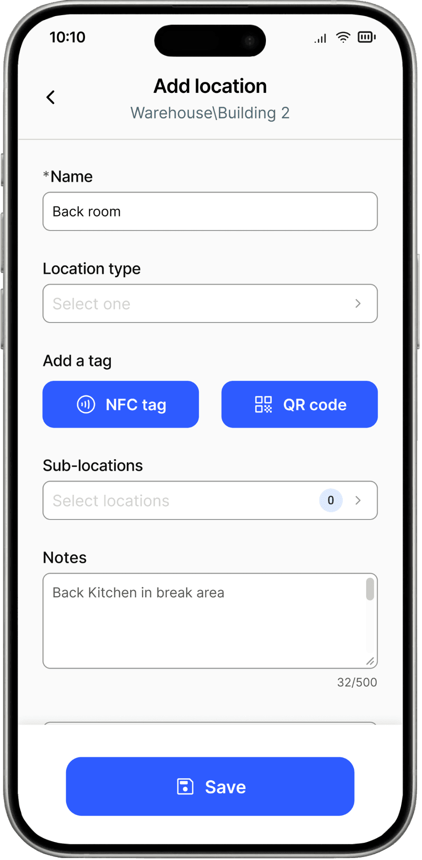

The end result was smooth, even if you've never used a mobile phone to set up a location, it was straight forward. The part I am most proud of? The simplicity and parity between how locations are managed on desktop, and how it's improved, but still the same language, as the new mobile experience.
The end result was smooth, even if you've never used a mobile phone to set up a location, it was straight forward. The part I am most proud of? The simplicity and parity between how locations are managed on desktop, and how it's improved, but still the same language, as the new mobile experience.
The end result was smooth, even if you've never used a mobile phone to set up a location, it was straight forward. The part I am most proud of? The simplicity and parity between how locations are managed on desktop, and how it's improved, but still the same language, as the new mobile experience.
02 / AUDITS
For our cleaning companies, they have similar needs and functionality that the security guards do. The audit flow is for a manager to inspect physical work to ensure the cleaners are meeting their contract cleaning standards. While there aren't QR codes to scan, or GPS tracking required, they do have a route they typically follow to inspect the jobs site, and we gave everything they needed in the palm of their hand. When a manager/auditor goes through their job sites to confirm the work is up to their contracted standards, they may need to take photographs for proof-of-service, leave comments to add context, or create a follow-up issue for a cleaner to return to correct an issue.
For our cleaning companies, they have similar needs and functionality that the security guards do. The audit flow is for a manager to inspect physical work to ensure the cleaners are meeting their contract cleaning standards. While there aren't QR codes to scan, or GPS tracking required, they do have a route they typically follow to inspect the jobs site, and we gave everything they needed in the palm of their hand. When a manager/auditor goes through their job sites to confirm the work is up to their contracted standards, they may need to take photographs for proof-of-service, leave comments to add context, or create a follow-up issue for a cleaner to return to correct an issue.
For our cleaning companies, they have similar needs and functionality that the security guards do. The audit flow is for a manager to inspect physical work to ensure the cleaners are meeting their contract cleaning standards. While there aren't QR codes to scan, or GPS tracking required, they do have a route they typically follow to inspect the jobs site, and we gave everything they needed in the palm of their hand. When a manager/auditor goes through their job sites to confirm the work is up to their contracted standards, they may need to take photographs for proof-of-service, leave comments to add context, or create a follow-up issue for a cleaner to return to correct an issue.

The main design challenge was ease of use. We know the average cleaner and manager isn't a tech-pro, some are contract workers that cycle in-and-out, and having a simple to use, easy to follow app was paramount. What you see here is the audit screen a manager/auditor would have to go through on one of their rounds. They start their audit with just the basic information they need (location, correct name, date, etc.) Below that is the template that was created by a site manager of all the checks they need to hit, and questions they need to answer. Adding photographs as a proof of work, leaving comments for added context, and prompting follow-up issues is all part of the routine, and is easily accessible in a clean format for the not-so-tech-savvy users.
The main design challenge was ease of use. We know the average cleaner and manager isn't a tech-pro, some are contract workers that cycle in-and-out, and having a simple to use, easy to follow app was paramount. What you see here is the audit screen a manager/auditor would have to go through on one of their rounds. They start their audit with just the basic information they need (location, correct name, date, etc.) Below that is the template that was created by a site manager of all the checks they need to hit, and questions they need to answer. Adding photographs as a proof of work, leaving comments for added context, and prompting follow-up issues is all part of the routine, and is easily accessible in a clean format for the not-so-tech-savvy users.
The main design challenge was ease of use. We know the average cleaner and manager isn't a tech-pro, some are contract workers that cycle in-and-out, and having a simple to use, easy to follow app was paramount. What you see here is the audit screen a manager/auditor would have to go through on one of their rounds. They start their audit with just the basic information they need (location, correct name, date, etc.) Below that is the template that was created by a site manager of all the checks they need to hit, and questions they need to answer. Adding photographs as a proof of work, leaving comments for added context, and prompting follow-up issues is all part of the routine, and is easily accessible in a clean format for the not-so-tech-savvy users.

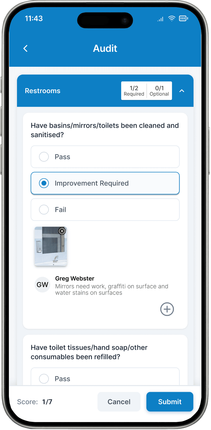
The part I'm most proud of is the feedback we got about the ease of use. Our senior users have been asking for a mobile app to run their audits for a long time. This frees up the pen and paper trail, writing things down to return back to the office and copy it to a computer file, and using a physical camera and transferring the photos. When we tested this with our beta users, they were happy to finally have something, but hearing about the time savings and ease of use meant we not only hit our business goal, I know I made a difference for the hundreds of companies using our product.
The part I'm most proud of is the feedback we got about the ease of use. Our senior users have been asking for a mobile app to run their audits for a long time. This frees up the pen and paper trail, writing things down to return back to the office and copy it to a computer file, and using a physical camera and transferring the photos. When we tested this with our beta users, they were happy to finally have something, but hearing about the time savings and ease of use meant we not only hit our business goal, I know I made a difference for the hundreds of companies using our product.
The part I'm most proud of is the feedback we got about the ease of use. Our senior users have been asking for a mobile app to run their audits for a long time. This frees up the pen and paper trail, writing things down to return back to the office and copy it to a computer file, and using a physical camera and transferring the photos. When we tested this with our beta users, they were happy to finally have something, but hearing about the time savings and ease of use meant we not only hit our business goal, I know I made a difference for the hundreds of companies using our product.
03 / CUSTOM BRANDING
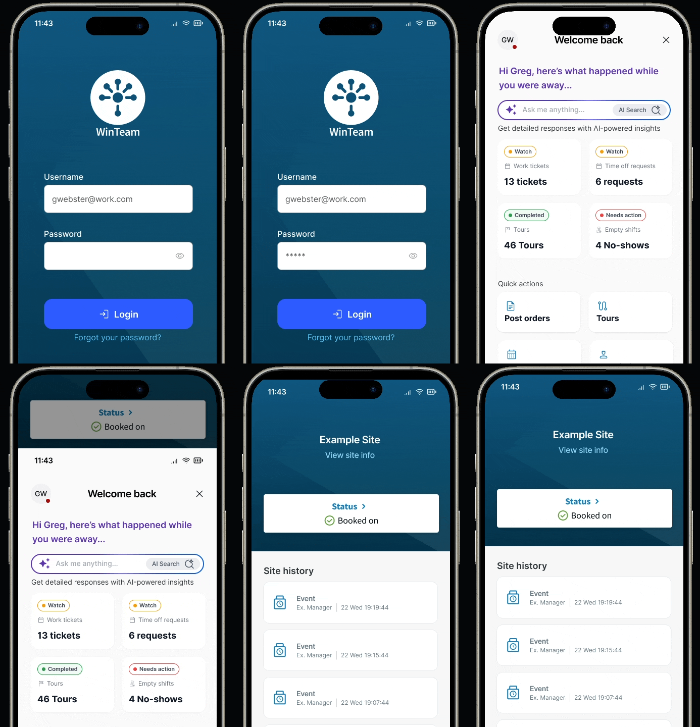
Our mobile apps use our companies color theme. The primary is a blue, secondary is a lighter blue, and all of our products are being built with the same design system and color variables. One of the big asks with WTMobile is for a company to have their own, custom theming. Why you ask? Well, many security guards are contract workers, and they may have 3-4 active contracts with various companies, all using our product. When Guard A signs into WTMobile to go work for Company A, then later that night does another shift with Company B, it can feel a bit impersonal. A worker may be trying to log into a shift and getting error message after error message because they are signed into their wrong instance. This led us to our next mobile design challenge, custom branding.
Our mobile apps use our companies color theme. The primary is a blue, secondary is a lighter blue, and all of our products are being built with the same design system and color variables. One of the big asks with WTMobile is for a company to have their own, custom theming. Why you ask? Well, many security guards are contract workers, and they may have 3-4 active contracts with various companies, all using our product. When Guard A signs into WTMobile to go work for Company A, then later that night does another shift with Company B, it can feel a bit impersonal. A worker may be trying to log into a shift and getting error message after error message because they are signed into their wrong instance. This led us to our next mobile design challenge, custom branding.

The biggest challenge here? Accessibility. Giving the keys to color theming for your product feels reckless. I'm not saying all managers of security companies don't have adequate color theory backgrounds, but I remember the days of geocities and myspace, where you could decorate your page with whatever contrasting colors you wanted, and every visitor was stuck squinting and neon yellows with green text. I created a template of 77 colors, and 9 shades to give our companies the choice on a color. They can also upload on image to be displayed on the home screen, and a company message in the menu header. This could be anything from a company motto, a short bulletin, or simply "Happy thanksgiving" around November. I started with the color choices, and using a WCAG plug-in, tested each color with a contrasting text color that would pair with it, to pass all contrast tests.
The biggest challenge here? Accessibility. Giving the keys to color theming for your product feels reckless. I'm not saying all managers of security companies don't have adequate color theory backgrounds, but I remember the days of geocities and myspace, where you could decorate your page with whatever contrasting colors you wanted, and every visitor was stuck squinting and neon yellows with green text. I created a template of 77 colors, and 9 shades to give our companies the choice on a color. They can also upload on image to be displayed on the home screen, and a company message in the menu header. This could be anything from a company motto, a short bulletin, or simply "Happy thanksgiving" around November. I started with the color choices, and using a WCAG plug-in, tested each color with a contrasting text color that would pair with it, to pass all contrast tests.
The biggest challenge here? Accessibility. Giving the keys to color theming for your product feels reckless. I'm not saying all managers of security companies don't have adequate color theory backgrounds, but I remember the days of geocities and myspace, where you could decorate your page with whatever contrasting colors you wanted, and every visitor was stuck squinting and neon yellows with green text. I created a template of 77 colors, and 9 shades to give our companies the choice on a color. They can also upload on image to be displayed on the home screen, and a company message in the menu header. This could be anything from a company motto, a short bulletin, or simply "Happy thanksgiving" around November. I started with the color choices, and using a WCAG plug-in, tested each color with a contrasting text color that would pair with it, to pass all contrast tests.

The next challenge was adding logos and personal messages to the menu. We needed to confine the space for a logo, set requirements that each company had to adhere too, and carve out an appropriate amount of real estate. There are three things happening here:
A 50x50 pixel logo for your instance card, this is where a security guard with multiple contracts selecting which instance they are trying to log on for.
A 250x50 pixel logo that lives on the top of the screen. This will show when ever a user is on their instances home screen, or menu.
A company message that lives on the menu screen, in the header, right below the logo. This message has a 105 character max, it will default to 16pt, but if it wraps to 3 lines of text, it will shrink to 14pt font.
The next challenge was adding logos and personal messages to the menu. We needed to confine the space for a logo, set requirements that each company had to adhere too, and carve out an appropriate amount of real estate. There are three things happening here:
A 50x50 pixel logo for your instance card, this is where a security guard with multiple contracts selecting which instance they are trying to log on for.
A 250x50 pixel logo that lives on the top of the screen. This will show when ever a user is on their instances home screen, or menu.
A company message that lives on the menu screen, in the header, right below the logo. This message has a 105 character max, it will default to 16pt, but if it wraps to 3 lines of text, it will shrink to 14pt font.
The next challenge was adding logos and personal messages to the menu. We needed to confine the space for a logo, set requirements that each company had to adhere too, and carve out an appropriate amount of real estate. There are three things happening here:
A 50x50 pixel logo for your instance card, this is where a security guard with multiple contracts selecting which instance they are trying to log on for.
A 250x50 pixel logo that lives on the top of the screen. This will show when ever a user is on their instances home screen, or menu.
A company message that lives on the menu screen, in the header, right below the logo. This message has a 105 character max, it will default to 16pt, but if it wraps to 3 lines of text, it will shrink to 14pt font.
Template for customization

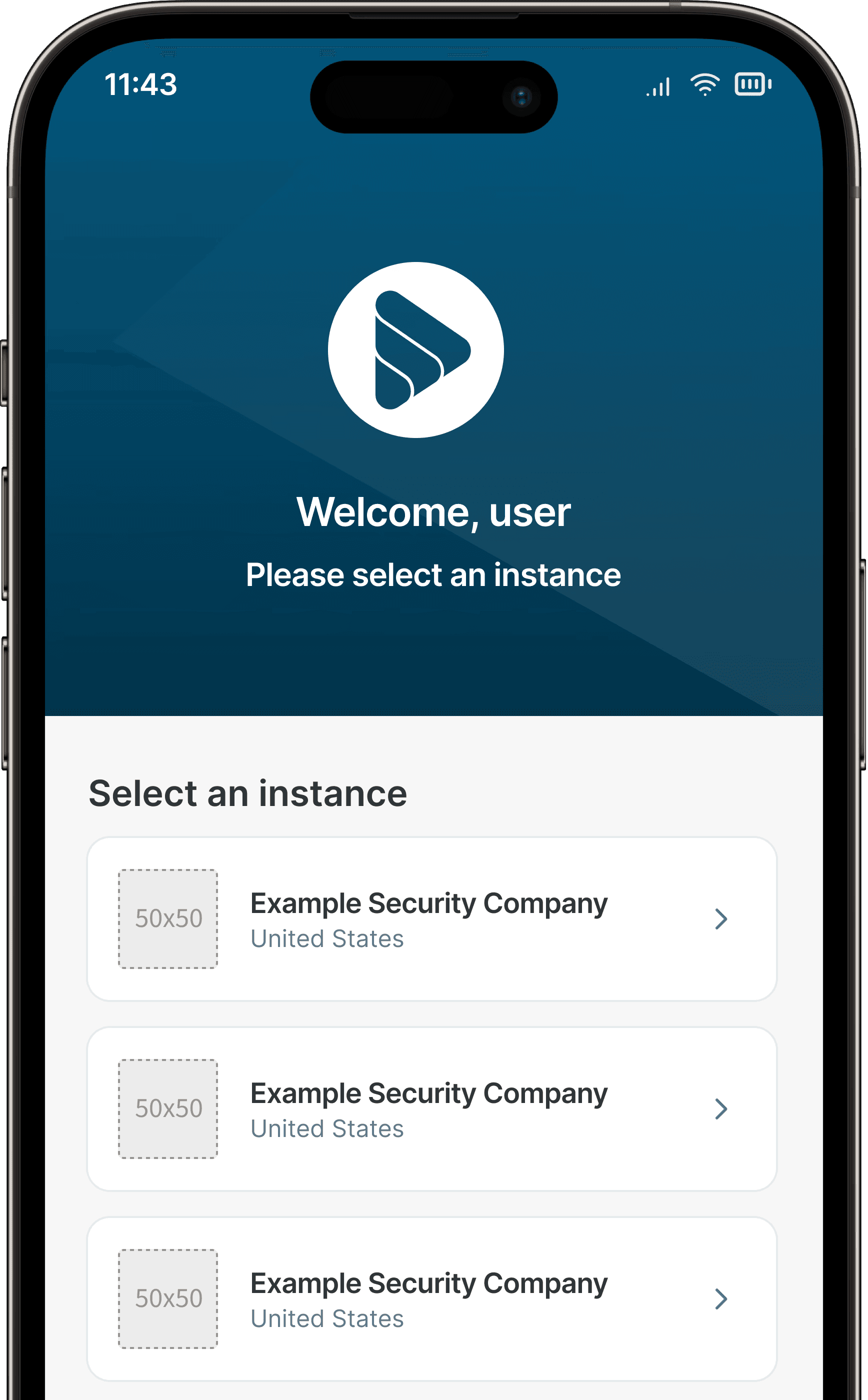


Example of how the customization could look


RESULTS
A more useful kind of modernization.
A more useful kind of modernization.
A more useful kind of modernization.
The work created a foundation for field-ready mobile experiences: less paper, clearer proof of service, and a product that could evolve without losing the people it was built for. Here's what happened when people started using it:
The work created a foundation for field-ready mobile experiences: less paper, clearer proof of service, and a product that could evolve without losing the people it was built for. Here's what happened when people started using it:
The work created a foundation for field-ready mobile experiences: less paper, clearer proof of service, and a product that could evolve without losing the people it was built for. Here's what happened when people started using it:
30+
Years of product history brought to mobile
3
Third-party apps removed by adding guard touring, reporting, and scheduling in one app
Rating on the iOS app store
80% parity
between iOS and Android platforms
100M
increased revenue with WTMobile as an offering
2
Internal apps being sunset with the success of WTMobile
KEY TAKEAWAYS
Modernization is a careful handoff, not a clean slate.
Modernization is a careful handoff, not a clean slate.
Modernization is a careful handoff, not a clean slate.
Across the three mobile case studies, the biggest learning was that modernization is less about replacing a legacy product than removing the friction around it. Location Manager worked because it preserved the language and parity of the desktop system while making a repetitive field task faster. Audits worked because they brought the whole proof-of-service loop (checklists, photos, comments, and follow-up issues) into the moment of work, instead of asking people to recreate it back at a desk. In both cases, the mobile app succeeded by consolidating work people were already doing across paper, cameras, and third-party tools.
That made familiarity a design principle, not a constraint. Field users were moving between locations, working under pressure, or picking up the product with little technical training. The right mobile pattern was often the one that asked them to learn the least: keep the product’s language recognizable, simplify the happy path, and make edge cases available without making them part of every task. The strongest measure of the work was not how different the mobile UI looked; it was how quickly it became dependable.
Custom branding added a final lesson: flexibility only creates value when the system can protect people from its complexity. Supporting dozens of client themes meant building guardrails for contrast, hierarchy, and content length rather than handing over unrestricted choice. That balance, speed without losing judgment and consistency without losing identity, is what I carry into the next generation of the product, including the new design system and the careful, human-in-the-loop use of AI.
Across the three mobile case studies, the biggest learning was that modernization is less about replacing a legacy product than removing the friction around it. Location Manager worked because it preserved the language and parity of the desktop system while making a repetitive field task faster. Audits worked because they brought the whole proof-of-service loop (checklists, photos, comments, and follow-up issues) into the moment of work, instead of asking people to recreate it back at a desk. In both cases, the mobile app succeeded by consolidating work people were already doing across paper, cameras, and third-party tools.
That made familiarity a design principle, not a constraint. Field users were moving between locations, working under pressure, or picking up the product with little technical training. The right mobile pattern was often the one that asked them to learn the least: keep the product’s language recognizable, simplify the happy path, and make edge cases available without making them part of every task. The strongest measure of the work was not how different the mobile UI looked; it was how quickly it became dependable.
Custom branding added a final lesson: flexibility only creates value when the system can protect people from its complexity. Supporting dozens of client themes meant building guardrails for contrast, hierarchy, and content length rather than handing over unrestricted choice. That balance, speed without losing judgment and consistency without losing identity, is what I carry into the next generation of the product, including the new design system and the careful, human-in-the-loop use of AI.
Across the three mobile case studies, the biggest learning was that modernization is less about replacing a legacy product than removing the friction around it. Location Manager worked because it preserved the language and parity of the desktop system while making a repetitive field task faster. Audits worked because they brought the whole proof-of-service loop (checklists, photos, comments, and follow-up issues) into the moment of work, instead of asking people to recreate it back at a desk. In both cases, the mobile app succeeded by consolidating work people were already doing across paper, cameras, and third-party tools.
That made familiarity a design principle, not a constraint. Field users were moving between locations, working under pressure, or picking up the product with little technical training. The right mobile pattern was often the one that asked them to learn the least: keep the product’s language recognizable, simplify the happy path, and make edge cases available without making them part of every task. The strongest measure of the work was not how different the mobile UI looked; it was how quickly it became dependable.
Custom branding added a final lesson: flexibility only creates value when the system can protect people from its complexity. Supporting dozens of client themes meant building guardrails for contrast, hierarchy, and content length rather than handing over unrestricted choice. That balance, speed without losing judgment and consistency without losing identity, is what I carry into the next generation of the product, including the new design system and the careful, human-in-the-loop use of AI.
Greg Webster / Mobile app build
Greg Webster / Mobile app build