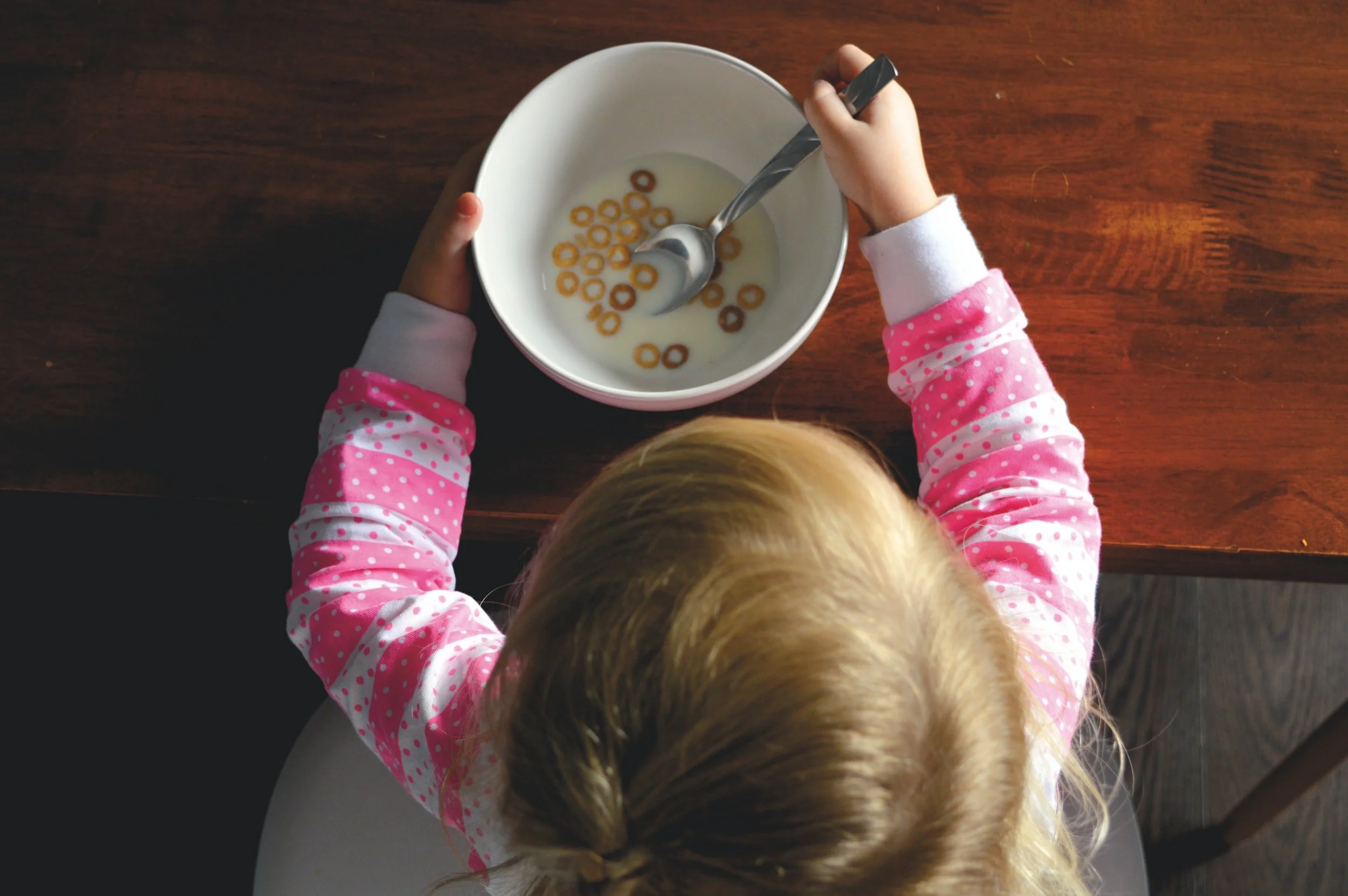
NEIL THE NUTRITIONIST
I utilized LinkedIn Learning, training modules, and countless hours of playing on Figma to get a better understanding of the program. My wife and I keep track of our health, diet and lifestyle habits, and have periodically used apps like MyFitnessPal or Strava to track our day-to-day wellbeing. However, with our two kids, it’s a bit trickier as their needs are changing from year to year. My wife has mentioned in passing how she wished there was an app to show much water they should be drinking, the ratios of foods they should be eating, and to know how portion sizes for the vegetable juices she makes. That’s when a lightbulb went off, I’ll prototype an app on Figma for that! So below is just that, starting off with sketching, and took it all the way to prototyping.

Project: Neil the Nutritionist
Brief: I wanted to make an app that could track children aged two to sixteen’s health & wellbeing, as well as give parents insight on the suggested healthy patterns choices to implement in their lives.
Solution: Created a prototype of a child friendly app that both parents and children could use to educate them on healthy lifestyle habits. It can be used to track their daily intake of both food and water, show recipes, or even go as in depth as tracking specific nutrients (protein, calories, sugar, etc.). “Neil” also gives users the ability to track exercise/activities, and offer suggestions based on location if desired. The app also tracks sleep, and joins these four (food, water, activity, sleep) in an easy-to-use, child friendly way. The end result will be an app that’s both educational and helpful.
Programs Used:

I furthered my knowledge in Figma by using it for:
Wire-frames, prototypes, and Ideations
Utilized LinkedIn Learning’s courses on Figma
I used Adobe Photoshop for:
Personas, logo creations, graphics for prototypes
Research
My research for this app came from competitive analysis, looking primarily at MyFitnessPal, Food Muncher Jr., Food Explorer, Fooducate, 7 Minute Workout for Kids.

Aside from competitive analysis, I spoke with friends and family who have children and gathered insights, desires, and frustrations they have with their own children’s health habits. I also spoke with kids between the ages of 9 - 13 about my app/idea, which was great to be able to talk to both parents, and kids. I pitched ,my app idea and gathered feedback, that I wrapped into my prototype. Here were some of the insights:
Parents:
Value healthy recipes for their kids
Value knowing sleep requirements for their kids
Dislike the idea of kids having to use the app
However, do like the idea of making it engaging, and easy enough to use for kids
Children:
Wanted to know specifics on what they’re body is supposed to get in diet & sleep
Valued making it easy to use, and fun
Wanted games, or interactivity
Dislike boring text
Personas
Below are 4 persona’s I created in Adobe Photoshop, to showcase 4 potential users


Ideation/Feature Prioritization
This early phase was completed mostly on scrap paper, notepads, and through back and forth conversation with my wife. Below is one of the many sketchpads I doodled some ideas on.

So I had narrowed it down, as to what I wanted the app to look like. A user signs up, has the ability to create profiles (a unique profile for each child, if they should choose to do so) and once in those profiles, track the four main functions of Neil. Food (diet), Exercise (activity), Water intake, and Sleep. Those four main functions of the app are represented through a shape and colour, which gives two separate recognizable triggers.

Now that I have the four functions determined, I started creating wire-frames, user flows, and keeping it intuitive and easy to use for someone of any age. I decided to stay away from the word “diet”, and instead use “healthy eating” as it has a better connotation to it. The term diet can often carry a negative connotation, and healthy eating just seemed to fit. Here are a few key screens from the work space:
Style Guide
I created 8 text styles, 4 color styles, and a few buttons to be used throughout

User Flows
Below is an example of a user flow created for Neil, for a user going from the initial start-up app welcome screen, logging in, and getting to the main menu screen. It shows the errors that could occur along the way, where they’d take you, and ultimately the journey from starting the app, to logging into the account and ending up at the main menu.

Select a Profile
This is the Main Menu/home screen, as you can horizontally scroll to select the profile you want to go into, add a profile, or learn facts/tips about the four main functions. Once the profile is selected, it takes you to the Profile Home, where you have the four functions to choose between. As you can see, there is still room until I reach high-fidelity images, colours, etc.

Exercise
Here’s a sample of one of the four functions, exercise/activity. I had the idea for the exercise portion to function where you could log a child’s activity, and it would give you an idea of the recommended amount of physical activity for a child of that age. If you or your child wanted ideas for something active to do, a search function with videos, tips and information on common activities could be utilized. Another neat function was the ability to pair the exercise with the healthy eating tab in a calculator, where a horizontal scrolling page allowed you to select common snacks/foods with activity, and tell the user how much of that particular exercise they’d need to do to burn off the calories from the food they consumed. It’s all still in the works, but you can see the outline of the pages and how’d they work.

Prototype
I wanted to create the prototype of the app while furthering my learning on Figma, so I started with the basics, and dove deep into the tutorials, learning classes, and LinkedIn certificates. Below is an early iteration of the frames included for Neil the Nutritionist, a few of the logo’s, and home screen were starting to get high level of detail, as I got excited about starting the process.

When signing up for Neil, I wanted to have a quick prototype of an introduction/welcome screen that cycles through the 4 shapes/colours, what they all mean, and can offer the user. I didn’t know exactly how I wanted this to look, but in general I wanted the 4 shapes/colours to cycle through one at a time, with a blurb about what they mean. I did a low-fidelity to get idea’s flowing, and how to use Figma to animate the introduction screen. Below is a video of my starting point.
After playing around with Figma’s smart animations, I ended up doubling the number of frames. This allowed me to have smooth flow between slides, allowing the text to slide in and the logos to cycle in a smooth, pleasing manner. I used this welcome screen as an opportunity to teach myself about Figma’s capabilities, and learn how the smart animation works. The prototype for the high-fidelity welcome screen can be seen below.
There’s still more I’d like to do with the welcome page, but for now, I have learned a few things in Figma that I’m happy with. I did a quick run through of Neil the Nutritionist, to take the prototype for a test drive and see how it looks. I’ve learned a lot from just doing this test run, and some of those lessons learned will be in the iterations section below. However, here’s a video of how the app tested:
User Testing Insights
After several rounds of user testings, a few things were clear:
Users liked having all four options, however both Healthy Eating and Exercise weren’t as simple as water & sleep
Users liked how the app was easy, colorful, and friendly for all ages
Various screens need UI changes for clarity and usability
Many functions weren’t fully done in the prototype, confusion as why some functions worked, others didn’t
Conclusion/Lessons Learned
An overarching lesson is to keep things simple. Or as my 7th grade teacher taught me, the “KISS” design principle, of “Keep It Simple, Stupid”. Just in this slide below, under the function of “Healthy Eating” we have what seemed to be a fairly simple idea of logging food, searching recipes, creating common meals to help log food quicker, etc. However this is obviously a TON of information, essentially it’s an app entirely on its own. The steps seemed simple, but the number of screens that would have to be created is enormous, and that’s just for one of the four functions.

After comparing the direction I was headed with already existing apps, it does appear that I am being ambitious in the amount this app is trying to accomplish. It was intuitive and did test well with children using it, although there would need to be further testing once the pages were all flushed out. I enjoyed using Figma for this project, and found it to be an extremely effective tool.