
BrainStation Coursework
In June 2018, I enrolled into the BrainStation UX Design course in downtown Toronto. The course covered an umbrella of topics to help develop a functional prototype of an app called ‘Gather’. I have laid out our brainstorming, personas, user research, wire-framing, interviews and prototyping to show how our group went from concept to functioning application.
The Team: Nick Veenema, Kazden Cattapan, Carol Ching, & Emma Stratton


The above are images of our finished prototype that I had created, however the road to this design took a lot of work, I’ll go through the journey of how we went from pencil and paper sketches, to a working Invision prototype. It started with a problem, the problem being:
Finding a venue or event in your city
Organizing your group of friends to get together
After discussing the functionality of the app, and how it will solve our problem, we agreed on a collective product description. This gave us a direction to head and somewhere to focus our attention.

Next up was our creating user interviews. We wanted a target audience of men and women between the ages of 19-35 who go out anywhere from once a week, to once a month. Running a successful user interview isn’t as easy as asking questions that are written on a sheet, there are many bias inflections, responses, or leading segues that may influence a user. We developed 18 questions ranging from the number of times you go out in a month, to planning questions, and app specific questions about privacy and functionality. I conducted 5 of the surveys and created a simple excel sheet with the rest of our groups answers, colour coordinating the answers into specific ranged responses for finding the specific behaviors to cater to.
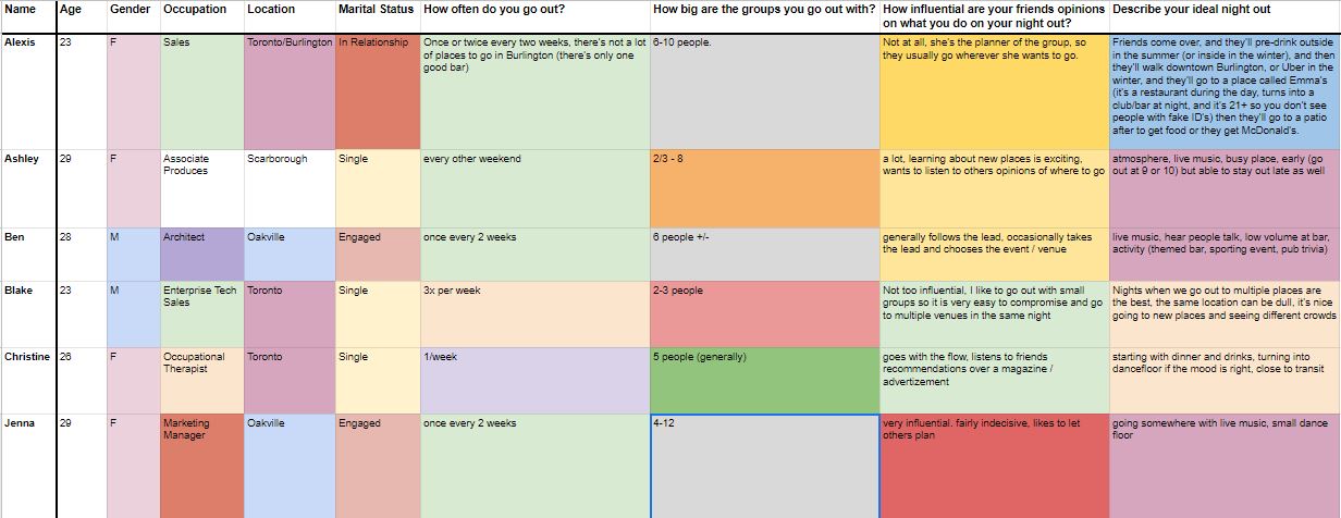
We observed three very specific behaviours we need to cater to with the app:
Users who make the plan, and lead and influence their friends through decisions on where to go for the night.
Users who don’t want to plan at all, they just want to go where their friends are, and can be influenced to go somewhere new or different if friends are going.
Users who do a bit of both, they want to have some input on the plan, but may not want to take charge on all the decisions.
We also discovered that our users are concerned with things like the cost of an event, how busy the event usually is, what kind of music, etc., so we need to provide some basic information on all the venues the app lists. They tend to go out in groups as small as 2 or as large as 10, so having group chat functions are very important.
Up next we created three user personas. I took the liberty of creating the graphics for the persona pages, and the content was help from the whole group. We needed 3 personas, one that took on the characteristics of all 3 specific behaviours outlined from our user interviews


The next step was taking the information we had from our user interviews, and our newly created user personas and create a work flow of information. We know what we wanted the app to be able to do, but how does it all get laid out? The group all had their own visions of Gather still, but it was slowly becoming a closely shared vision. It was time to put pen to paper and create some charts, first up Information Architecture.

This was my first attempt at Information Architecture. The above shows a map of the key functions of the app, and how they would interact with each other. This step was new to me, and being as I’ve worked in architecture I assumed it would be a breeze. Funny enough, I was quite wrong, it was more difficult to to visualize the function path a user would take on using this relatively simple app. It was a great exercise in realizing how much thought and trial and error go into even the most basic of functions. This is something that still stick with me today, dissecting websites/apps that I use regularly and understanding how intuitive they have become wasn’t an accident, but a well thought out structural design that is both a science, and an art. It is relatable to the structural engineering I see daily in my architecture career. The next step, was creating fluid user flows.


The user flows streamed seamlessly, and it seemed to fill in the cracks of our information architecture. As this was our first time creating user flows, we had these in our minds as we were creating our IA, which lead us to completing our user flow diagrams pretty quickly. Looking back at the lessons learned, you shouldn’t be hasty when completing IA and user flows, as they lay the groundwork for a seamlessly functioning program. The next step was a more graphic approach, which is something I was looking forward to. Below are a few sketches that I drew up from a group brainstorming session with the team. You’ll see a draft of our overall layout, logo ideas, and can see where we drew inspiration from other popular applications. Click through the slideshow below to see my hand drawn sketches on creating a group chat, and importing contacts.


These sketches led us to compiling wireframes using InVision to help create the working prototype. This was my first time using InVision, and found it to be a pretty intuitive program with great capabilities for prototyping. Below are some of the wireframes the group came up with for the venue screen. The screens are created for iOS, and have the operating system in mind when creating the prototype, so you’ll see different icons, placement, and style as we went through the process. We had created batches of wireframes for the other main screens, including the sign in page, search, profile, add a friend, etc. You will see them all in the InVision demo that is linked at the end.


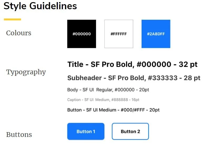
We were now on the overall style elements of our app, choosing a colour palette, fonts, how we want our buttons to look on hover vs. when pressed. There were a lot of ideas in our group, but we were all on the same page for almost everything. Plus, we were close to the end, so the few who were passionate about fonts got to have debates about every little detail. It was an interesting conversation, and seeing the subtle differences make a big impact on the overall feel, really opened my eyes to how many small details can make a lasting impression.

Everything came together for the deadline of our working InVision prototype, and we created mock-ups of what the finished app would actually look like. Even though we couldn’t take the project to the level we wanted, it was great to include the mock-ups and give the class a visualization of the finished product.
Click on the “Gather” logo to be taken to the prototype of our app.

In closing:
We learned that, as designers, we assume that our users will understand all features and functions, but that’s not always the case. Usability testing really helped us to develop our app, as functions we thought were primary to our flow were secondary to some users, and we were able to re-prioritize based on these learnings. In terms of our usability tests themselves, we worked through a couple iterations of questions to reach a point where we weren’t leading our users but allowing them to complete a natural flow and give us real insights. Another big learning point was the large number of screens required to build a medium fidelity prototype, even for the simple tasks. So we really needed to keep our user flows in mind to make sure we weren’t missing any steps.
Future progress:
With more time, we would increase the fidelity of the prototype by adding images of venues and making all screens scrollable. We would also work on interactions outside of the app, for example, what happens when someone is invited to join Gather. We would also add the feature to see what your friends are doing on the map for the persona that doesn’t like making plans but just wants to join their friends.