DEXCOM
Improvement to UX/UI of existing wearable technology
Diabetes, Dexcom & Wearable Technology
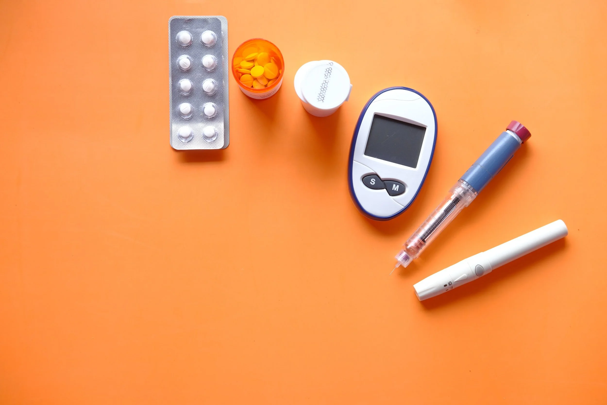
Type 1 Diabetes has affected members of my family, and I have grown up having a first hand experience at the struggles of living with the disease. However, there has been continual improvements to the technology available for managing type 1 diabetes. One piece of technology is called a continuous glucose monitor (CGM for short), which is a small device with a transmitter attached, that gets adhered to your body. A small fibre (about the thickness of a blade of hair) goes under the skin and will continuously update the wearer of their blood sugar levels by sending information from the transmitter, to a receiver. A company called Dexcom is a leader in the CGM technology, and their device communicates with smart devices, like a smartphone or watch. A diabetic wearing a Dexcom CGM can have their blood sugar levels, sent via the transmitter, to their watch and their cell phone. However, this technology is new, and there are a few improvements to the current app & watch face that I think would give the user more information that they could find useful. Below is a study of improvements that I looked at:
GLANCE WATCH FACE PROLOGUE

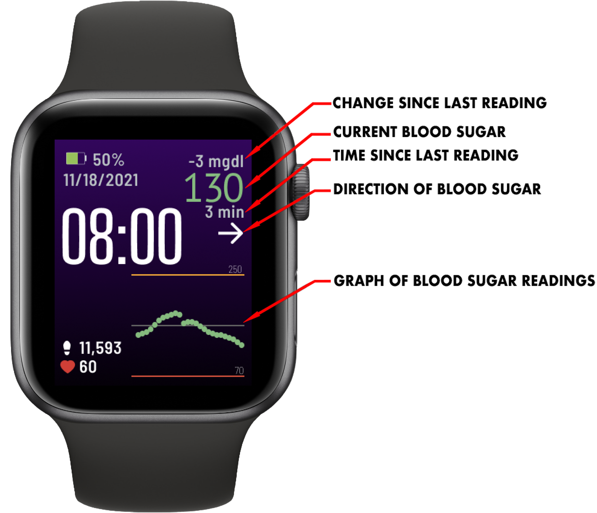
Home screen for the Glace Watchface

Secondary screen accessed via a single tap on the chart
Glance is the watch face that is used to display the information from the Dexcom CGM transmitter that gets sent to your phone and your watch. As you can see above, the image on the left shows the watch face’s main screen, which has the standard watch information such as: time, steps taken, heart rate, battery life and date. What it also shows is the information from the CGM, such as: current blood sugar level, change from the previous reading, how long since the last reading, direction your blood sugar is going, and a line graph showing the path of your readings.
These 5 features are incredibly helpful to a diabetic, and make it a useful tool to have. However, there’s so much opportunity for more. The watch face already has a tap function built in, when you tap on the graph, a secondary screen appears (accompanied by a vibrate) that stretches out the graph, showing a longer time period readings, giving the user a longer window of blood sugar readings. However, that’s where it falls flat, that’s the only benefit to the secondary screen. It removes the steps, heart rate, date, battery life, and shrinks the time.

Why is this area blank? There’s so much information that could be put there that’s already being gathered by the Dexcom CGM, it just and the Glance watch face is already grabbing parts of the information, but why not grab more?

“A user interface is like a joke. If you have to explain it, it’s not that good.”
I took a look at what information I would want to put on the watch face. What do diabetics find useful? What are simple metrics that can be displayed on a watch face that would be of interest of the user? What information is already gathered that could be easily displayed on the watch? I took a deep dive.
COMPARATIVE ANALYSIS / RESEARCH
The Dexcom CGM comes with an app for you phone that connects your phone to your CGM transmitter, and displays your blood sugar and the blood sugar graph. It’s a fairly simple app, with not much information besides your current blood sugar, it’s movement, and it’s history. Dexcom also has an app called Dexcom Clarity, that highlights your glucose trends, patterns and statistics. Sugarmate is a similar app to Dexcom Clarity, it is just a third party app that displays similar trends, patterns and stats in a different interface. There are however, different statistics available with Sugarmate, that are all taken from the CGM’s information.


There are numerous Dexcom companion apps, but Sugarmate and Dexcom Clarity are the two that came out on top in my research. Since all third party apps take the information from Dexcom Clarity, the Dexcom Clarity app is a no-brainer to include, but what Sugarmate does so well is takes that information and produce statistics with good UI.

Sugarmate’s statistic/features wall

Dexcom Clarity’s statistics
The three statistics that I want to feature on my Glance watch face update are:
Percentage in Range (a breakdown of percentage of the day your blood sugar was low, high, or in range)
Time in Range (basically a stop watch that resets every time you fall out of your target blood sugar range)
Average Glucose (the average blood sugar reading for your day)
This is a small list, but it needs to be small as the watch face is a small screen, so keeping the information concise, and with a purpose is important.
IDEATION & IMPLEMENTATION
Looking at the existing two screens, I wanted to keep the color scheme, fonts, and sizing similar, since I am only adding to the existing watch face, not re-imagining the entire thing. I found some icons via a Figma plugin called “iconify”, which helped me get an image for the three features.

These statistics are small enough to display on the watch face, and not take up too much valuable space. I originally wanted to be able to have them on the primary screen, above the steps and heart rate, as there is an empty block of space there. Here is how I imagined it:
Home Screen (Primary Screen)

Existing Primary Screen
An empty space above the heart rate and steps counter can be utilized for more quick data.

Potential Primary Screen
This is packing in the space, but all 3 features are shown on the screen in the same font and size as the steps and heart rate.
the only clickable area on the primary screen is the chart/graph in the lower right quadrant of the watch face. When touched, it took you to the secondary screen, which as shown before, seems to fall short. I wanted to add the three features to that screen originally, and not the home screen, but it has shown to be important enough information to diabetics, that not including it on the home screen doesn’t make sense.
Secondary Screen (on touch)

Existing Secondary Screen
On touch, the secondary screen appears showing a larger chart, removes the steps & heart rate, and moves the time to the top

Potential Secondary Screen
I originally only wanted to add the three extra features on this screen, which makes the top left quadrant a touch for a tertiary screen
The existing secondary screen has a large empty space in the top left quadrant, which seems like a strange design to me. The watch face makers moved the time to the top of the face and centered it, leaving this large void. I used that space to add the three features to this screen, and made the top the left quadrant a button to take you to the third (tertiary) screen.
Tertiary Screen (on touch)

Option 1
The most information

Option 2
Closest to existing layout

Option 3
A more well-thought-out layout
The new tertiary screen I am adding doesn’t need to follow any existing layout, however I want it to feel related to the existing watch face. I created 3 options based on the features I have previously highlighted to include, they are as follows:
Option 1 - This watch face is the busiest, and has the most data of all the options. I needed to show the 3 features, however I also kept the feeling of having the blood sugar chart on the bottom third of the screen. The chart is on the bottom of the existing two screens, and having a third screen means we could show the previous 24 hours of blood sugar readings, giving the user a more complete look at their days readings. In keeping the chart, I was left with a space above it that begs to be split into four. I can have my average blood sugar, consecutive time in range, and percentage in range, but that leaves me with a 4th option. After some research, it is quite apparent that expanding on percentage in range, and giving the user a look at their last 7 days average, to see how their current day compares to their previous weeks readings, is an extremely good metric to have. This information is available on both the dexcom clarity app, and the sugarmate app, and therefore can be calculated with the dexcom and developed into this watch face. Overall though, I feel like this is too much information, and wanted to make it cleaner, easier to read, and give a better user experience.
Option 2 - This watch face is much cleaner that option 1, as it has less information, but expands percentage in range, which my research shows is the most highly sought after metric. The three features are all displayed in a larger format, making it easier to read and more visually pleasing, and the time is in the same location and size as the existing secondary screen. This is a safe option, although I think this screen could be laid out more effectively.
Option 3 - This watch face expands on option two, moving the title of the main feature (percentage in range) over to a right-align, allowing the time to be expanded so it’s actually legible at a larger font size. The fonts are expanded on the features for an easier read, and the main feature has a slightly different look than option 2. As previously discussed, percentage in range is the most sought after metric, so I expanded this and showed not only the numbers for “Low” “In Range” and “High”, but also a circle display with the white line representing the percentages. The information available for the other two features (consectutive time in range, and average blood sugar) don’t show any further information, but are larger, and a more focal point of this screen.

Option 3
This screen is the layout I would go with, it expands on the most sought after metric (percentage in range) and displays the other features in more legible size. The time is moved to give the user an easier time reading their watch as the font is increased.
In the ends, option 3 hits all the points I was hoping for, and stays true to the existing design without cramming too much information onto the watch screen.
“Design is so simple. That’s why it’s so complicated.”
PROTOTYPE
Below is the existing watch face, and how it works switching between the primary and secondary screens. Beside it to the right, is the new prototype, with a primary, secondary and tertiary screen, showing the new data and how I think it should be put into the watch face.

Existing Watch Face Screens

Prototype Watch Face Screens
This is the finished product. Three screens that show the additional data that’s already gathered by the Dexcom. The additional data is valuable to a diabetic and having it easily accessible on their watch would be an improvement to their blood sugar control. The UI fits with the existing watch face, doesn’t overcrowd the smaller screen, and fills in areas that feel flat in the existing watch face.
CONCLUSION
I enjoyed taking a look at an existing app/watch face and making UX/UI improvements to it. The fact that my family is affected by type 1 diabetes meant that making these changes could actually benefit the people closest to me, which is even more rewarding than just being proud of your work. This is my first time working on a watch face, and it does come with a new set of challenges compared to web or mobile. I did some research on designing for watch faces, and after reading the Apple UI Design Handbook for Apple Watch, they really focuses in on 4 qualities: legible, concise, timely and personal. I kept those at the front of my mind when working on this watch face, as it’s easy to try and cram too much information in, that’s neither legible, nor concise. I thoroughly enjoyed this wearable UX/UI design challenge, and look forward to the next!
